Research lab
Secrets from the Best Brands: making popular Chronic Disease Apps
December 18, 2024 · 5 min read

Max Mamoyco
CEO
Given that chronic conditions require lifelong treatment, such apps must have a high retention rate and be well-received by users.
However, not all apps become popular, and it's not just due to market competition. The issue lies in poor user engagement and feature adoption.
Having medical professionals involved doesn't always help. Sometimes, users are even against them (!).
In fact, according to a study we’ll discuss shortly, self-management statistically yields better results than working with a doctor :)
What's needed is medical expertise in the field and an understanding of which features and UX techniques to use. That's what we'll explain to you now.
Before showing how specific solutions address these problems, let's first look at the three best representatives on the market that we will be showcasing later.
There are several app examples that are popular in the market and truly effective:
1. MyCOPD: the most comprehensive and intuitive COPD management app available on any device. It offers complete online pulmonary rehabilitation programs, allowing users to access top-tier COPD therapy from the comfort of their own homes.
And it really works. Just look at this study.
Outcomes: in a recent study, 41 patients hospitalized with severe COPD exacerbations were divided into two groups. One group continued their regular treatments, while the other group received their usual treatment plus access to the MyCOPD app.
The findings, published in the journal NPJ Digital Medicine, revealed that over three months, the group using the app experienced nearly half the number of exacerbations compared to the group receiving only the usual treatment (18 versus 34).
Additionally, incorrect use of inhalers dropped by approximately 80% among MyCOPD users, compared to a 30% reduction in the control group.
Interestingly, the average age of the app users was over 65. Despite not being regular internet users, all participants were able to adapt to the new technology.
And the main reason is the right features: self-management activity diary, weather and pollution forecasting, and a unique COPD Checklist.
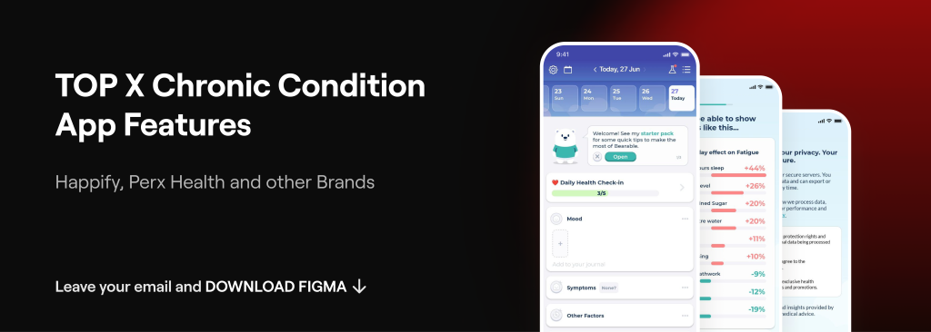
How can we select the most appropriate features for other apps in this field? To help with this, we have also compiled our top X features for chronic condition apps.
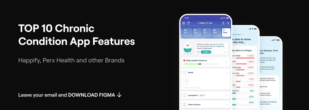
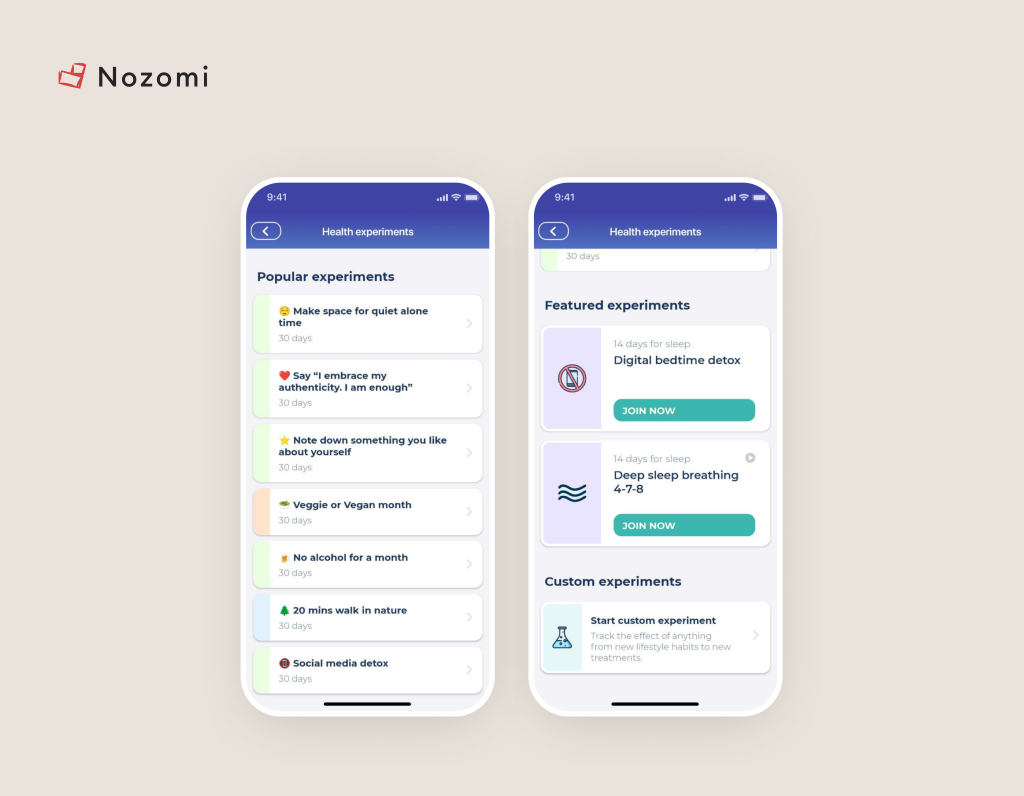
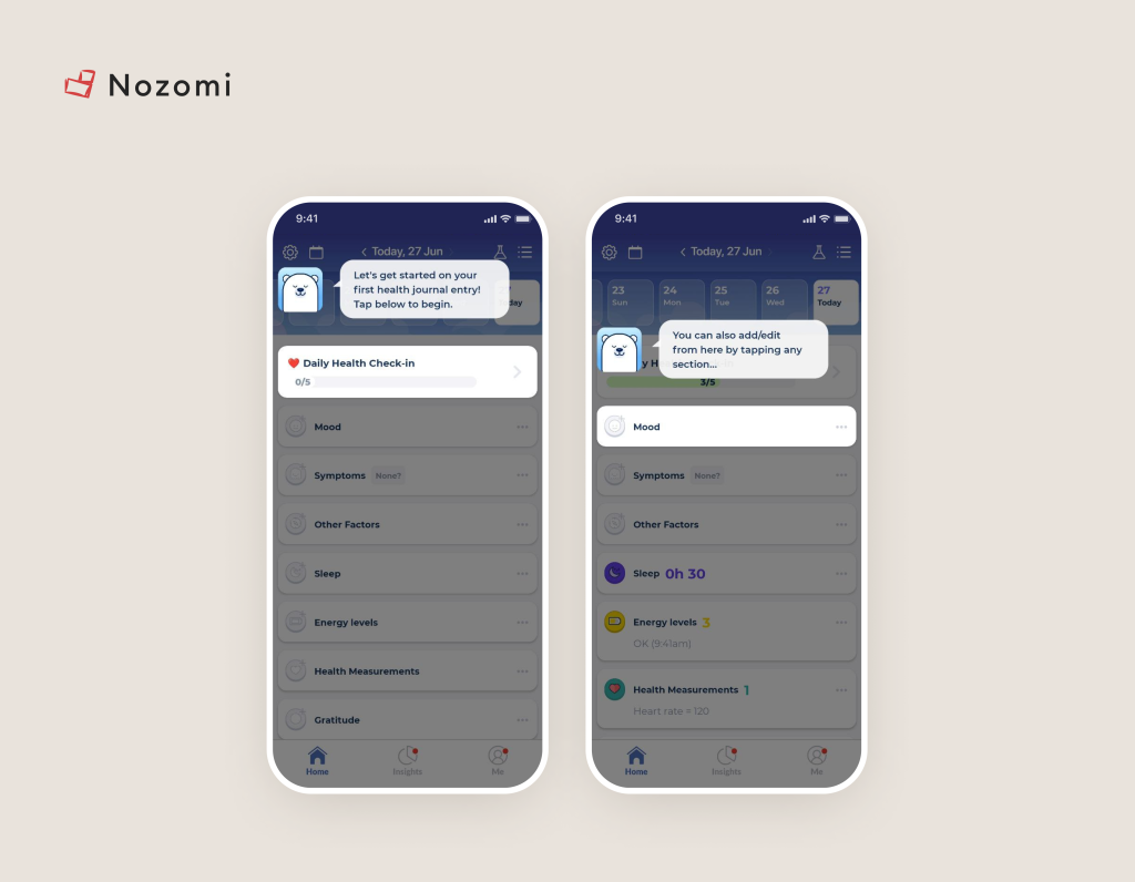
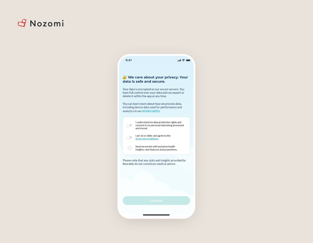
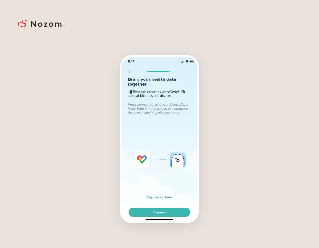
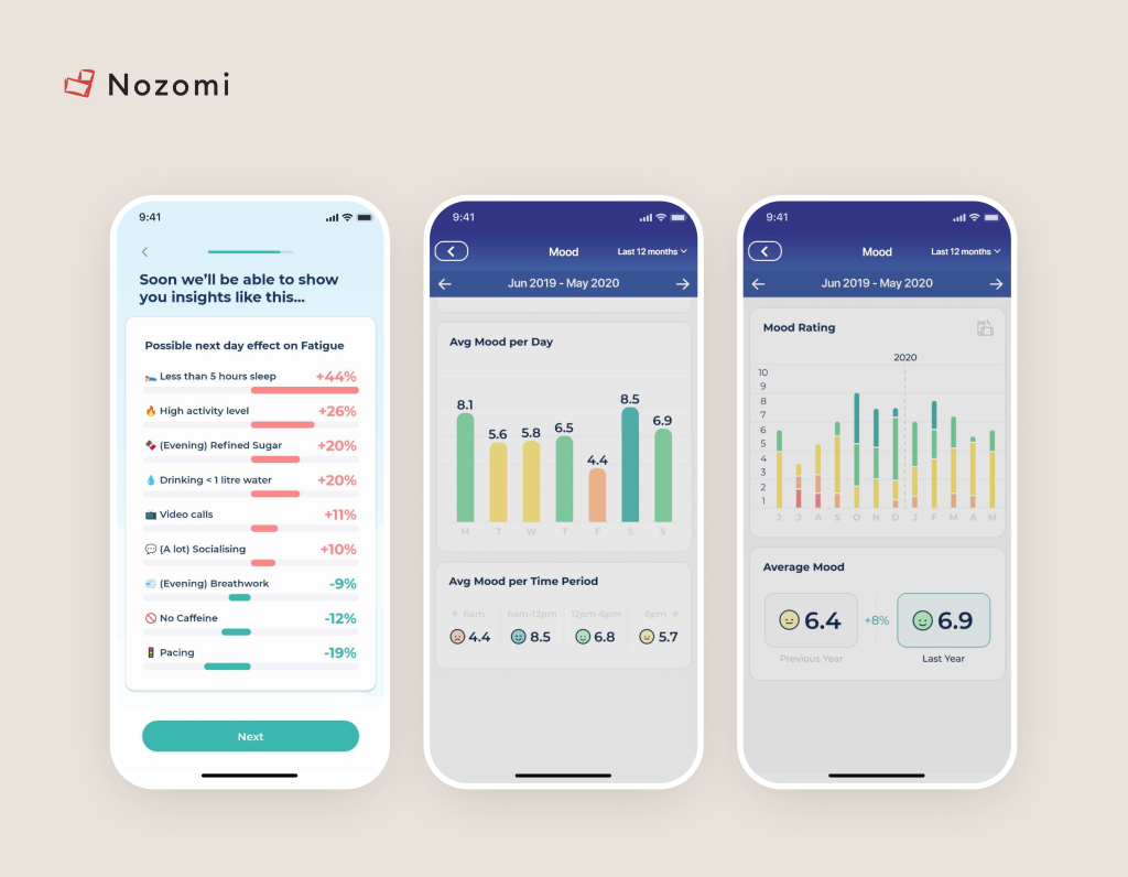
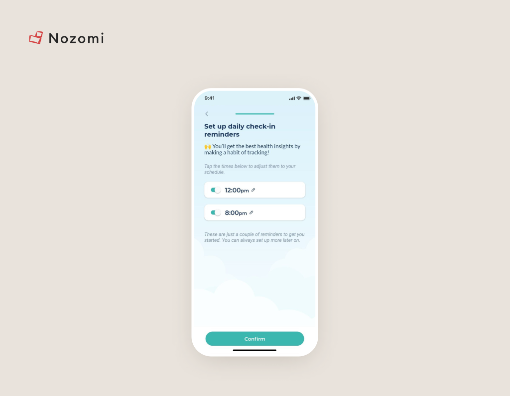
2. Bearable: all-in-one app designed to track various emotions, mental health conditions, and the intensity of symptoms such as pain, fatigue, and both acute and chronic illnesses.
It offers valuable insights into factors like mood, sleep, exercise, diet, and medication. With its high level of customization, Bearable provides tailored solutions to meet the unique needs of each user.
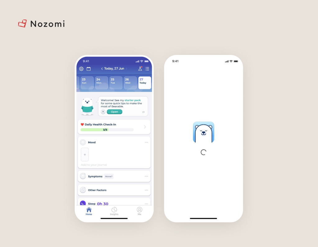
Image credit: Bearable
Related posts

Design
December 18, 2024 · 5 min read
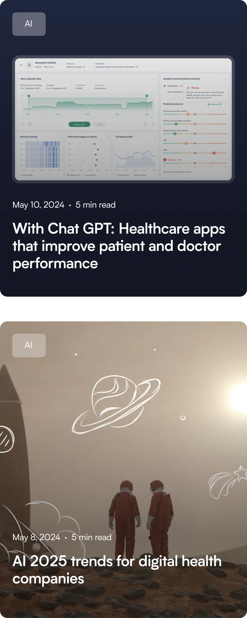
Better Outcomes: an overview of user Onboarding Practices in Digital Health

Patient Engagement
December 18, 2024 · 5 min read
How to enhance Growth Metrics of Digital Health product
Design
December 18, 2024 · 5 min read
3 Main Components of Gamification to engage users in Health Apps
Design
December 18, 2024 · 5 min read
7 Pillars of Simplicity for intuitive UX in Health Apps
Subscribe to receive latest hacks from our research team
10K
subscribers including top leaders read our newsletter

Contact us
Email, call or complete the form to learn how we can help you.
Email
m@nozomihealth.com
Phone
+48 514-468-485
Leave us a message
Drop us a message and we’ll reply within a day